


Download for free now
Thank you! Your submission has been received!
Oops! Something went wrong while submitting the form.

Which sense do you value the most? Many of us would say sight. And while other senses may be equally important, what we perceive visually – however subtle – can greatly impact on our mood, well-being and productivity.
But the visual world is big! From mood-enhancing colours to energising lighting, there are countless considerations. When it comes to workplace design, knowing where to start is key. So, let’s dive into the factors that influence and improve the visual elements of an office environment.
According to a 2019 survey, sight is the most valued sense. On average, participants would choose 4.6 years of life in perfect health over 10 years of life with complete sight loss.
Office design has come a long way over the years. Picture a traditional office, and you think of massive grey areas, rows of desks and little visual interest. Walk into a big space, and your eyes see everything on one level, which simultaneously overloads your visual perception.
“The railway carriage office”: you step onto the floor at one end and look straight down the floor plate to the door at the other end.
When we use the term ‘landscaping’, you might think of a well-designed garden or outdoor space. But actually, it can refer to workspaces and offices, too. Landscaping means creating interest, drawing attention and accentuating features.
Designing any environment should put human needs and human functionality first. What is this space for? And how can people thrive in it? This could be anything from sparking drama, creativity and excitement through to safe, secure and calm vibes.
In workspace landscaping, we design a floor plate – which allows us to play with how people read and interact with a space.
The 18th century English landscape architect Capability Brown – known for his naturalistic approach to designing gardens and landscapes – had some pretty impressive design principles, which we still lean on today.

As you can see, we can apply Brown’s design principles to workplace design. Visual appeal is vital, but it works hand in hand with other senses.
How are you drawn into a space? How do you engage with your space? How do you make the most of your space? These are just some questions we ask when mapping out your workspace journey, which is an essential aspect of designing your office.
Journeys differ in every organisation depending on how people work, what draws them in and what repels them.
You have a building with terrific views! Everyone says they’re the most amazing asset to your office. When bringing employees together and encouraging teamwork and collaboration, you have natural connection points – centred on great views.
But what if you lack amazing views? Or your building doesn’t have architectural features to celebrate? All is not lost! We can design areas that unite employees, through lighting, furnishing, colour and artwork. There are multiple ways to evoke interest, but it all starts with a ‘block plan’ so we can determine how your social, meeting or collaborative space will work, among other functions.
What’s a ‘block plan’? This is where we understand the building, the staff requirements and the floor plate. We then stitch this together to come up with a basic concept.
You can use colour, texture, pattern, light, greenery, and many other elements to influence a visual journey through your workspace. Let’s dive into three key visual considerations…
Ever stepped out into the sunshine and felt instantly happier? Or, equally, turned down a light and felt more relaxed? This is the basic concept underpinning light usage in the working environment.
Most of the time, we want to use lighting that supports and resets our circadian rhythm. You can maximise natural light by placing seating near windows, or you can use clever lighting installations to mimic natural light. You can do a lot – even if lighting isn’t abundant in your space.
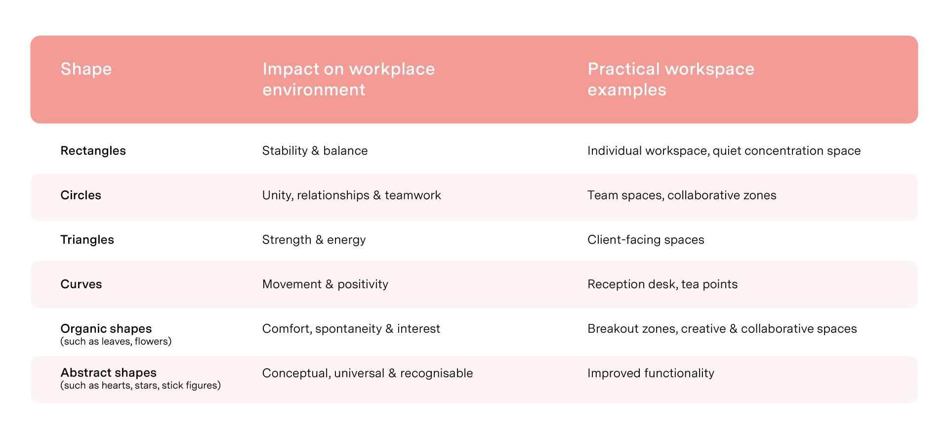
Sometimes taken for granted, shapes can significantly impact on our mood, behaviour and journey through spaces.
The symbolism of colours comes from both our history and culture, as well as our shared societal understanding. We connect ideas and emotions to specific colours. For instance, the table below offers some common symbolic interpretations for each colour:

There are three attributes of colour to consider:
Colours that are not so saturated and relatively white are more relaxing. More saturated colours are more energising.
Red means danger. That’s our assumption and, often, our gut response. As a species, we tend to link red with bleeding, injury and death. However, what about red in Chinese culture? There, red is associated with life-generating energy and is the colour of prosperity and celebration.
White has a dramatically different association depending on where you are. In the Western world, we connect white with cleanliness and purity. But in many Asian cultures, white is the colour of mourning (Sound Business podcast with Julian Treasure – episode 08 with Dr Sally Augustin)
Awareness of interpretation could be crucial to your office design, especially if you have a multicultural workforce or engaging with international clients.
Colour is a great tool for improving the visual environment of your office. Highlighting a walkway with colour is a simple way of creating a clear path for your employees and ensuring easy navigation. You can also use diagonal cuts of colour across a floor plate to break up areas and make different zones.
Not everyone’s visual journey looks the same. A big, open, visual expanse filled with people might make some feel exposed and uncomfortable. Yet, others might enjoy the ‘airy’ feel.
Common visual design conundrums
Yes, everyone is different. Therefore, workplace design must adhere to diverse needs. Visual pockets – places where employees can retreat to – will create an environment where everyone feels comfortable. You’re never designing for one, you’re designing for many, and that means your design needs layers.

With 15–20% of the world considered neurodiverse, forward-thinking employers are ditching ‘designing for the masses’ and making spaces that adapt to individual needs.
Consider the following:
Studies found that neurodiverse teams are 30% more productive than neurotypical ones and made fewer errors – Harvard Business Review.
Stare at a grey wall in your workplace and boredom, lack of motivation and waning productivity will soon seep in. But picture a great visual environment – colour, light, art, biophilia, space – and you’ll feel instantly boosted. Employers who invest in improving the workplace experience, such as making visual quality a priority, are the ones who will attract and retain talent within their organisations.
Our top nine visual considerations:
Our team is always happy to discuss how we can help enhance your visual environment. You can get in touch with us here.
Keep reading the Making Sense(s) of the Workplace series.
Which sense do you value the most? Many of us would say sight. And while other senses may be equally important, what we perceive visually – however subtle – can greatly impact on our mood, well-being and productivity.
But the visual world is big! From mood-enhancing colours to energising lighting, there are countless considerations. When it comes to workplace design, knowing where to start is key. So, let’s dive into the factors that influence and improve the visual elements of an office environment.
According to a 2019 survey, sight is the most valued sense. On average, participants would choose 4.6 years of life in perfect health over 10 years of life with complete sight loss.
Office design has come a long way over the years. Picture a traditional office, and you think of massive grey areas, rows of desks and little visual interest. Walk into a big space, and your eyes see everything on one level, which simultaneously overloads your visual perception.
“The railway carriage office”: you step onto the floor at one end and look straight down the floor plate to the door at the other end.
When we use the term ‘landscaping’, you might think of a well-designed garden or outdoor space. But actually, it can refer to workspaces and offices, too. Landscaping means creating interest, drawing attention and accentuating features.
Designing any environment should put human needs and human functionality first. What is this space for? And how can people thrive in it? This could be anything from sparking drama, creativity and excitement through to safe, secure and calm vibes.
In workspace landscaping, we design a floor plate – which allows us to play with how people read and interact with a space.
The 18th century English landscape architect Capability Brown – known for his naturalistic approach to designing gardens and landscapes – had some pretty impressive design principles, which we still lean on today.
As you can see, we can apply Brown’s design principles to workplace design. Visual appeal is vital, but it works hand in hand with other senses.
How are you drawn into a space? How do you engage with your space? How do you make the most of your space? These are just some questions we ask when mapping out your workspace journey, which is an essential aspect of designing your office.
Journeys differ in every organisation depending on how people work, what draws them in and what repels them.
You have a building with terrific views! Everyone says they’re the most amazing asset to your office. When bringing employees together and encouraging teamwork and collaboration, you have natural connection points – centred on great views.
But what if you lack amazing views? Or your building doesn’t have architectural features to celebrate? All is not lost! We can design areas that unite employees, through lighting, furnishing, colour and artwork. There are multiple ways to evoke interest, but it all starts with a ‘block plan’ so we can determine how your social, meeting or collaborative space will work, among other functions.
What’s a ‘block plan’? This is where we understand the building, the staff requirements and the floor plate. We then stitch this together to come up with a basic concept.
You can use colour, texture, pattern, light, greenery, and many other elements to influence a visual journey through your workspace. Let’s dive into three key visual considerations…
Ever stepped out into the sunshine and felt instantly happier? Or, equally, turned down a light and felt more relaxed? This is the basic concept underpinning light usage in the working environment.
Most of the time, we want to use lighting that supports and resets our circadian rhythm. You can maximise natural light by placing seating near windows, or you can use clever lighting installations to mimic natural light. You can do a lot – even if lighting isn’t abundant in your space.
Sometimes taken for granted, shapes can significantly impact on our mood, behaviour and journey through spaces.
The symbolism of colours comes from both our history and culture, as well as our shared societal understanding. We connect ideas and emotions to specific colours. For instance, the table below offers some common symbolic interpretations for each colour:
There are three attributes of colour to consider:
Colours that are not so saturated and relatively white are more relaxing. More saturated colours are more energising.
Red means danger. That’s our assumption and, often, our gut response. As a species, we tend to link red with bleeding, injury and death. However, what about red in Chinese culture? There, red is associated with life-generating energy and is the colour of prosperity and celebration.
White has a dramatically different association depending on where you are. In the Western world, we connect white with cleanliness and purity. But in many Asian cultures, white is the colour of mourning (Sound Business podcast with Julian Treasure – episode 08 with Dr Sally Augustin)
Awareness of interpretation could be crucial to your office design, especially if you have a multicultural workforce or engaging with international clients.
Colour is a great tool for improving the visual environment of your office. Highlighting a walkway with colour is a simple way of creating a clear path for your employees and ensuring easy navigation. You can also use diagonal cuts of colour across a floor plate to break up areas and make different zones.
Not everyone’s visual journey looks the same. A big, open, visual expanse filled with people might make some feel exposed and uncomfortable. Yet, others might enjoy the ‘airy’ feel.
Common visual design conundrums
Yes, everyone is different. Therefore, workplace design must adhere to diverse needs. Visual pockets – places where employees can retreat to – will create an environment where everyone feels comfortable. You’re never designing for one, you’re designing for many, and that means your design needs layers.
With 15–20% of the world considered neurodiverse, forward-thinking employers are ditching ‘designing for the masses’ and making spaces that adapt to individual needs.
Consider the following:
Studies found that neurodiverse teams are 30% more productive than neurotypical ones and made fewer errors – Harvard Business Review.
Stare at a grey wall in your workplace and boredom, lack of motivation and waning productivity will soon seep in. But picture a great visual environment – colour, light, art, biophilia, space – and you’ll feel instantly boosted. Employers who invest in improving the workplace experience, such as making visual quality a priority, are the ones who will attract and retain talent within their organisations.
Our top nine visual considerations:
Our team is always happy to discuss how we can help enhance your visual environment. You can get in touch with us here.
Keep reading the Making Sense(s) of the Workplace series.


